
Studio Set Series: Backdrop Colors ~ Brand Photography ~ Vancouver, WA
Today's blog post is a fun one... it's all about colors and color theory!
Earlier this year, I wrote a similar blog post about ALL of the sheet colors I offer for my studio's bedroom set, and I highlighted why (or why not) each color could be an ideal choice for you. Depending on your eye color, your skin tone, and the outfit you're wearing in the session... some sheet colors might be more complementary than others.
I gave a list of questions to take into account when choosing the sheet color for your boudoir shoot... and today I'll be doing something similar! Instead of thinking about boudoir sessions, though, we'll be changing gears and thinking about brand photography!
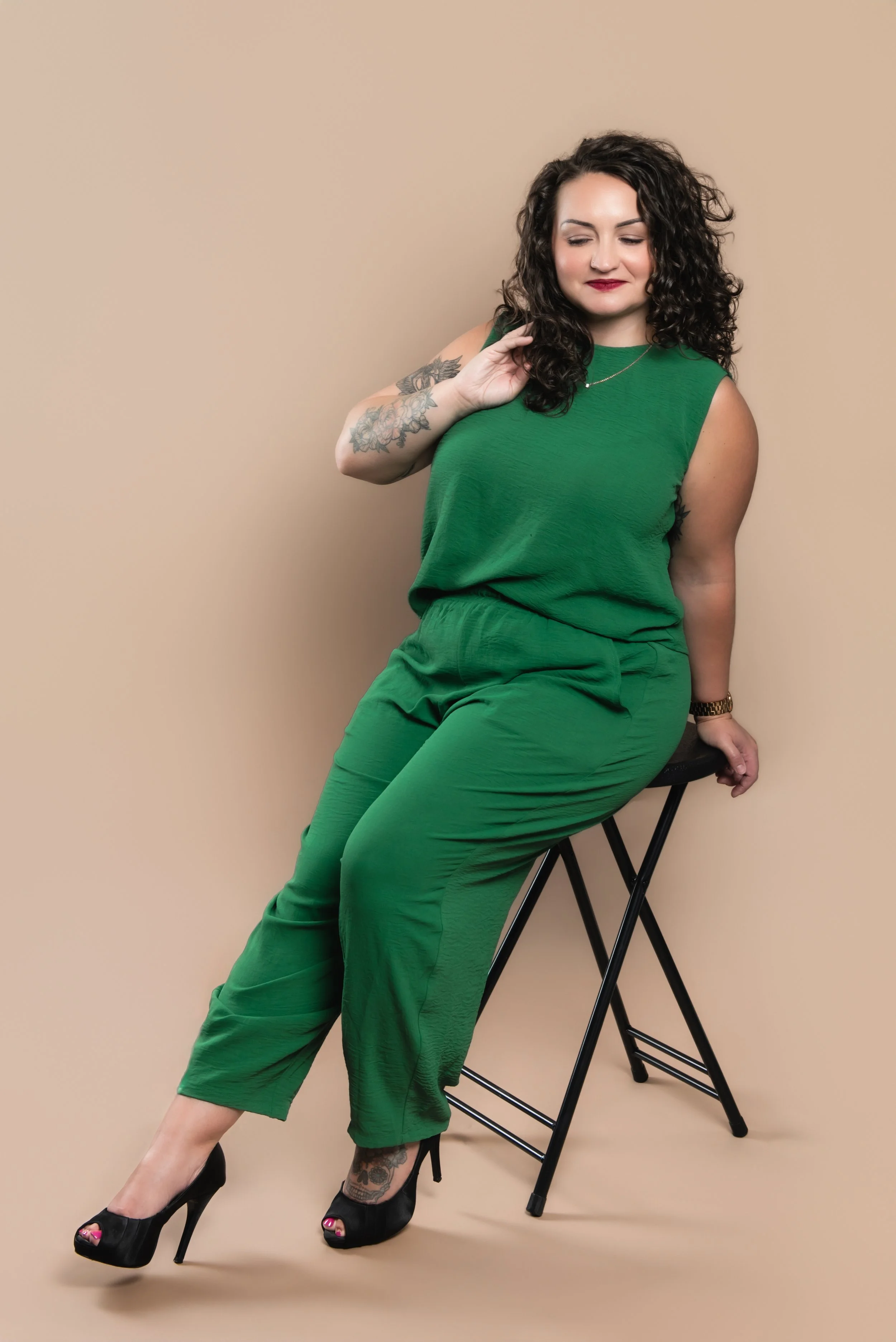
When capturing your headshot, I want to make sure we capture who YOU are in your professional life... and one of the best ways to do that is through color theory! That's why I recently invited a model to my studio and photographed her in front of each of my studio backdrop colors. Even though it was super fun to play around in the studio, get creative, and take some new headshots in the process... the main reason of having this model session was YOU. I want you to be able to compare the colors and use the following questions to consider the best option for you!




What industry do you work in?
If you work in industries like law, financial services, or the medical field... I would consider our white, gray, or black backdrops! These fields often require more of a formal headshot, so the colorful backdrops wouldn't be the best match in this case. A white, gray, or black backdrop could also be used for a professional website biography.
If you work in more of a creative field like the arts or you have a fun, small business as a maker... I would consider one of our brighter colors! We offer red, yellow, green, two shades of blue, pink, and tan.
What colors do you use for your professional branding?
I have a variety of color options in the studio so that we can coordinate our backdrop with your existing branding color scheme! As an added perk of matching the backdrop to your branding... we can show a little personality in the images! Getting colorful can be a LOT of fun if your brand matches that vibe.
Do you use a specific color code on your own website?
While I do have a variety of colors in the studio, if there's a color code that you use on your own website... I have the technology to change the backdrop to pretty much any color your heart desires! All you'd have to do is share the specific color with me, and I can work my magic during the editing process. This is a great option for somebody who already has an established, recognizable set of colors on their website or logo.






If you're interested in having your own headshot taken, I'd love to chat and talk about which backdrop color is the one for you! Whether a classic black or white backdrop works best or you prefer something a bit brighter to match your fun, playful branding... we can take care of you! Luckily, reaching out and chatting with me is easier than ever. All you have to do is click on the button below!